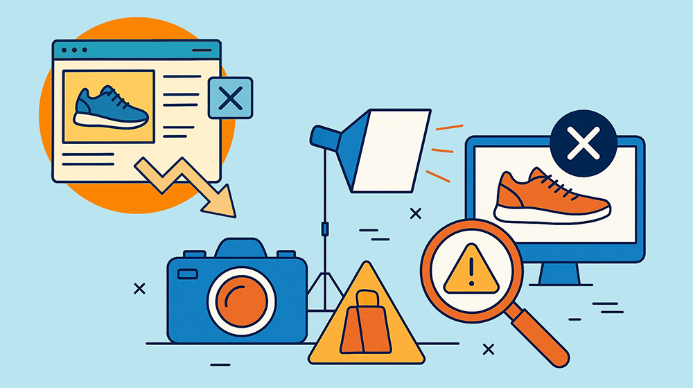
Everyone agrees that consistency sells. The real question is how do professional brands achieve it at scale and not by chance, but through a structured QA process.
We all know consistent product images drive higher conversions but the real challenge is achieving that consistency at scale. That’s why we spoke with our Team Lead QA International, Valentina Diara, to uncover the key principles behind truly consistent e-commerce imagery.
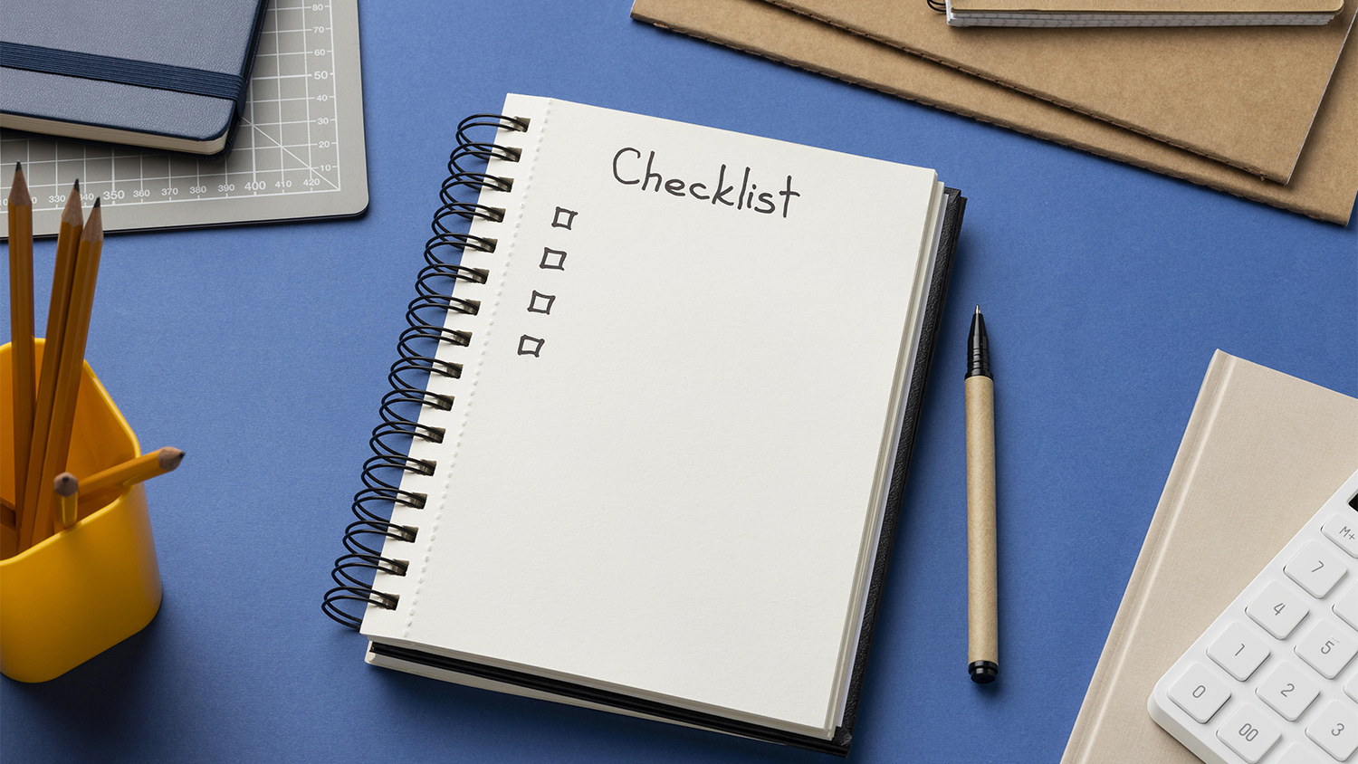
But wait, there’s more, because from that conversation, we developed Doopic’s internal QA Checklist, a practical guide you can download for free and start using to improve your own product images today.
How Consistency Is Obtained
Consistency is not a design choice; it’s a system. According to McKinsey & Company, “consistency is the secret ingredient to making customers happy,” yet it remains one of the hardest goals to achieve and “requires top-leadership attention” (source).
When every image, touchpoint, or product listing follows a defined pattern, brands build trust and recognition that lasts. McKinsey’s research found that companies focusing on consistent customer journeys, not just isolated interactions, can increase satisfaction by 20%, boost revenue by 15%, and reduce service costs by 20%.
In e-commerce, the same rule applies visually. One inconsistent image among hundreds can break customer confidence, just as one broken process can ruin a good service. McKinsey warns that “a single negative experience has four to five times greater relative impact than a positive one,” underscoring why visual coherence must be built, maintained, and verified at every step.
So how is consistency achieved in practice? It depends on three operational pillars:
The Doopic Product Image QA Checklist
“Consistency isn’t achieved by luck” says Valentina, “it comes from process, control, and repetition”. This checklist is the same framework from our Quality Assurance team that you can use to review your images every day before they go live.
Each point below represents a decision that directly affects how professional, trustworthy, and conversion-ready your product images appear. Use it to audit your current catalog, align your internal standards, and speed up your path to visual consistency.
Here’s how to check your images step by step.
How to use the checklist effectively
Each checkpoint in the table is more than advice. It reflects the same QA framework Doopic uses to deliver consistent image quality at scale. By understanding how each standard connects to Doopic’s internal workflow, you can apply professional-grade quality control to your own product images.
1. Image Size and Format
Use 72–96 dpi for web use, unless you are printing them out, keep files between 400KB and 4MB, and avoid images wider than 3000 px. This balance ensures fast loading without visual loss.
At Doopic: image resizing and compression are automated through Doopic’s proprietary plugins guaranteeing every file is optimized before client delivery.
2. Realism Over Perfection
Avoid excessive retouching or AI filters that erase real textures, (Valentina could not stress this enough). “Clothes should look wearable”, and materials must preserve depth and grain.
At Doopic: all outputs pass a human QA check where over-edited results are flagged and corrected to maintain authenticity and brand realism.
3. Sharp Focus
Every product must appear crisp and clear. Always zoom to 100% to verify fine details such as seams, labels, textures, and edges. Blurred or soft areas instantly reduce perceived quality and make the image look unprofessional.
When reviewing clarity, also assess the relationship between sharpness and clipping. If certain product areas are slightly blurry, it is often better to correct the original background rather than apply an aggressive clipping path. Over-clipping can emphasize flaws and create unnatural edges. The priority is a clean, consistent product outline without sacrificing realism or detail.
At Doopic: our QA specialists verify sharpness at multiple zoom levels and reject any image that fails internal focus calibration benchmarks.
4. Lighting and Background
Use identical light sources, direction, and background nuance across all product images. Visual uniformity creates coherence and strengthens brand perception.
At Doopic: QA teams reference a background tone library and apply automated light balance checks to ensure visual consistency across sessions.
5. Shadows and Reflections
A soft shadow or mirrored base adds depth and realism, especially for standing or reflective products. Keep shadow style and intensity consistent across all items.
At Doopic: shadow and reflection parameters are preset by category, then fine-tuned by editors to maintain natural but consistent results.
6. Image Order
Maintain a predictable viewing sequence, for example, front → side → back. This simple order helps users navigate visually and compare products easily.
At Doopic: automated upload templates enforce uniform image order across all SKUs, ensuring marketplace and webshop consistency.
7. Angles and Framing
Keep the same distance, crop, and camera angle for every product type. Changing perspective disrupts the buyer’s visual flow and weakens perceived quality.
At Doopic: AI-powered alignment tools standardize framing during upload and flag deviations from defined product templates.
8. File Naming and Alt Text
Use a logical, descriptive structure such as brand_product_color_view.jpg. Keep the same naming pattern and write clear alt text for accessibility and SEO.
At Doopic: naming and alt-text structures are synchronized with client SKU data through my.doopic, preventing duplicate or inconsistent file references.
9. Functional Context
Show how the product is used, an open clasp, a button pressed, or a garment being worn. This builds understanding and helps customers visualize use.
At Doopic: our platform allows editors to tag “functional views,” ensuring optional context shots are consistent and easy to identify for clients.
10. Final Review
Before publishing, inspect the full set together. The question is simple: does this look like one brand? Remove or correct any image that stands out.
At Doopic: final QA approval is always performed by a human specialist. Each batch is reviewed as a whole to confirm uniform lighting, tone, and presentation before release.
How Doopic Manages Consistent Output at 20,000 Images per Day
Achieving consistency once is simple. Achieving it 20,000 times a day is a system. At Doopic, that system combines AI precision with human QA control. Our proprietary workflow flags irregularities automatically while our international QA specialists validate color tone, realism, and alignment in real time.
Every image passes through multiple checkpoints before approval, automated optimization, manual verification, and final delivery review. The result is the same visual language across entire product lines, regardless of scale or season.
This is how e-commerce brands maintain the visual trust that drives conversions, and how Doopic ensures it never looks like chance.
Learn more about how Doopic delivers consistency at scale.
.jpg)